
Are white people more prone to terrorism? (EDA on US-Mass-Shootings Dataset)
I’m not trying to sound racist but you’ll see why i said that just towards the end of this post. But first here’s the story.


I’m not trying to sound racist but you’ll see why i said that just towards the end of this post. But first here’s the story.
I have been familiarizing myself with data science, the widely popularized field of study with the rise of AI, over he last couple of months and have been constantly fascinated by its potential applications. This inquisitiveness led me into the world of Kaggle one day. When I discovered Kaggle the little fan girl inside me rejoiced seeing how cool the Kaggle community is.
The amount of knowledge you can gain from following the work of other professional and aspiring data scientists plus the amount of shared community datasets are such incredible resources for anyone looking to step into data sceince. Highly recommended.
So going through some datasets I came across the striking US Mass Shootings — Last 50 Years (1966–2017) dataset generously shared by Zeeshan-ul-hassan Usmani. I have met Zesshan once during a speech he delivered in Colombo where he presented few of his inspiring case studies. Incredible guy. Go follow him on Twitter ->
Coming back to the dataset, it contained detailed information of 398 mass shootings in the United States. Not only due to terrorism, but also due to other factors such as domestic violence, mental health conditions, social problems etc. The overview I quote:
The US has witnessed 398 mass shootings in last 50 years that resulted in 1,996 deaths and 2,488 injured. The average number of mass shootings per year is 7 for the last 50 years that would claim 39 lives and 48 injured per year.
These facts resemble a darker side of the world we live in. The fact that we can use our knowledge to create meaning out of the past and help the future ways of peace even by a tiny amount should be the inspiration behind analysis on such data.
With that in mind here are some of the visualizations generated using the dataset.
Side Note: I’m no professional in data science. I took great help from others who have shared their kernels for these results. I used Python with numpy, pandas, matplotlib, seabron and geopy libraries. If there are any wrongdoings with the analytics, let me know in the comments.
First, the US map showing the locations of all reported incidents. The size of the bubbles identifies the amount of fatalities in each incident.
Let’s have a look at the yearly number of incidents.

A significant increase in attacks is very much clear towards the latter. We might think of connections between the rise of religious extremists and social instabilities with these results, but I would also argue that this can be a outcome of the improvement of reporting such incidents especially with the rise of social media.
Next, what can we see from the total number of attacks categorized by the month?

Seem to increase towards the beginning and the end of an year. Also see the total number of victims against each month.

We can go on breaking down the number of incidents reported by each day of the month.
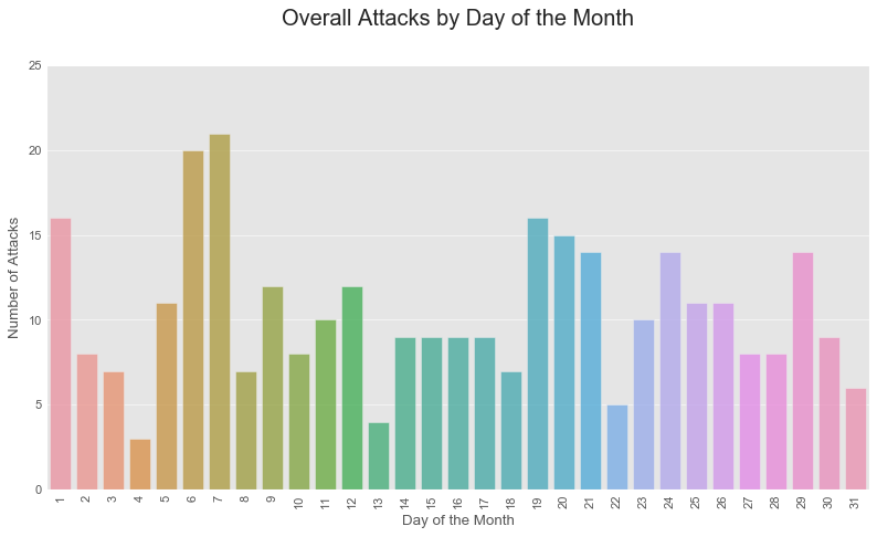
Looks like the attacks are somewhat spread all over a month. But then if we group the attacks by each day of the week, we get this.
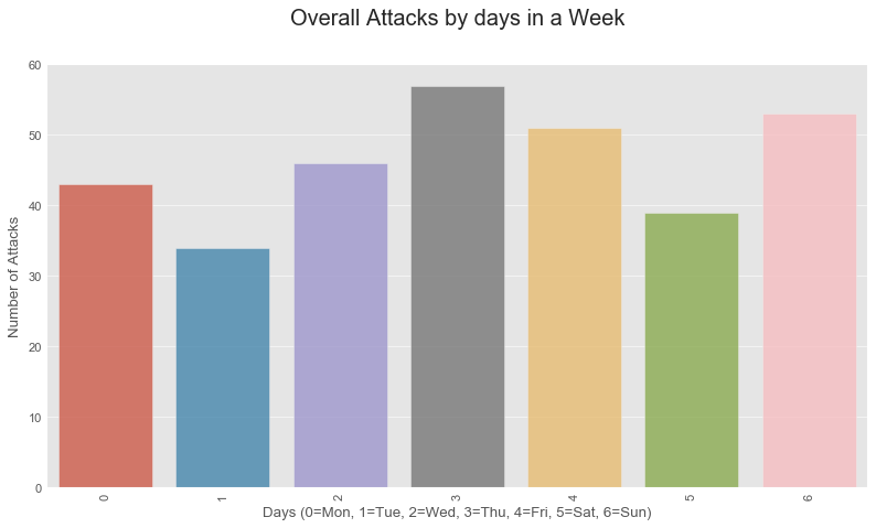
Looking at this it’s clear that the cumulative number of attacks during weekdays would be greater than that of weekends. To just make it clearer, see the below graph.

Significantly the number of victims would be larger with attacks on weekdays for obvious reasons.
Next we look at how the gender of the shooter affects the number of victims.
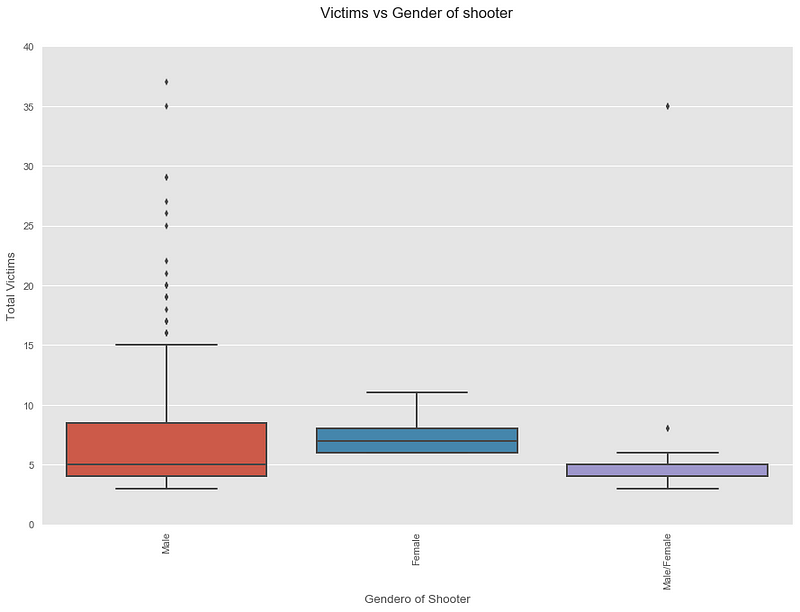
Male shooters have caused more damage considering with the outliers of the plot. Should be the case since the number of incidents involving a male shooter is significantly higher.
Does the age of the shooter tell us something about the incidents?

Well, the ages seems to spread across the range of 15–45 years when considered more than 3 attacks.
Lastly the below plot visualizes the cumulative number of victims by their race.
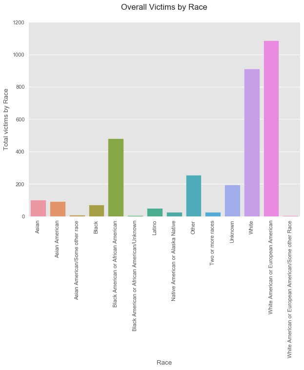
Looking at the plot it’s obvious that white Americans including European Americans have faced significantly more damage during mass shooting in the US over the last 50 years. The values report almost 2000 victims of these races, which is around 60% out of all reported victims in this dataset.
Does that depict a major target of these mass shootings over the years? Does it mean that white people in the US are more prone to terrorism in the future? Well, not exactly. Not all mass shooting incidents in this dataset were caused by terrorism at the first place. Although the data shows such a tendency with regard to all mass shooting causes, I think there has to be more elements to this in order to draw such a conclusion. Preferably more data points.
Anyway, food for thought.
Remarks:
This article takes a general path along some common EDA techniques for beginner level data analytics. This can be a good starting point for anyone interested in data science to grab hold of the general norms of data handling and interpretation of visuals.
The evolving power of data science will pave way to reveal insights that were unseen before. The applications will be soon popularized over many fields and industries that will reshape the way we think and act.
I’m looking forward to share more learnings on data science in time to come.
Give a clap👏 if it was worth reading so others could also find this article. Thanks.